Rebuilding Madagascar's 2017 plague outbreak, then a what-if
MemeLab rebuilds Madagascar's 2017 pneumonic plague outbreak from lab-confirmed cases and a published case correction, then models a hypothetical town.
Pneumonic plague is the form of plague that spreads from person to person, typically by respiratory droplets. I took the best-documented modern outbreak, Madagascar in 2017, and rebuilt it in MemeLab, my browser-based outbreak simulator.
About 1,900 pneumonic cases were reported in that outbreak, but most were never confirmed. Only 32 were confirmed in the laboratory, and a later study estimates that about 78 people (range 50 to 119) were truly infected. That estimate of dozens of true infections is the size of the outbreak used in this post, not the reported count.
The short version: I fitted MemeLab to the confirmed cases with its case correction set to the published ratio, so the rebuilt outbreak comes to about 78 true infections. The 78 is the input. What the model adds is the spread rate: four of five runs fitted a reproduction number between 1.2 and 1.6, in line with published estimates. It is a fit made after the fact, not a forecast, and it rests on very few simulated individuals.
The post then does something different. It asks a what-if: how might pneumonic plague spread in a hypothetical town of 50,000 people over six weeks? That section is a model of how it might spread. It is not about any real place, and it is not a forecast.
What pneumonic plague is
Pneumonic plague is plague of the lungs. Unlike the flea-borne bubonic form, it can pass directly from one person to the next. Untreated, it is nearly always fatal. Antibiotics given early cure it, and given to contacts they prevent it (WHO fact sheet).
Its reputation rests on one catastrophe. In the winter of 1910-11 it spread along the railways of Manchuria with labourers travelling home for the New Year. There was no treatment and almost everyone who fell ill died: at the Changchun plague hospital, 1,201 of 1,214 admissions died, and the 13 who were discharged were judged not to have had plague. The 1911 international conference tabulated about 44,000 deaths; Wu Lien-teh, who led the response, later put the toll at 60,000 (conference report; Wu 1922). A second Manchurian epidemic in 1920-21 killed about 9,300 (Wu 1923).
Nothing since has come close. Gani and Leach pooled eight outbreaks from 1907 to 1997 and none had more than 42 cases. Before control measures began, the average case infected 1.3 others, and they estimated that 43% of introductions would spread to nobody (Gani & Leach 2004). Recent clusters are smaller still: four cases in Uganda in 2004, twelve in Qinghai, China in 2009, four in Peru in 2010. The largest between Manchuria and Madagascar were two mining-camp outbreaks in the Democratic Republic of the Congo, with 130 cases in 2005 and an estimated 162 in 2006 (Bertherat et al. 2011).
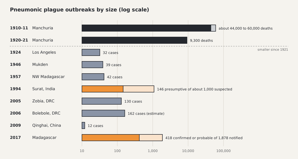
Ten documented outbreaks. The pale bars for Surat and Madagascar are suspected or notified cases; the solid part is what laboratory evidence supported.
Two patterns run through that record. The first is that the disease spreads less easily than its reputation suggests. Transmission needs close contact with someone who is already very ill, and the illness is short. In Uganda in 2004, 2 of 25 untreated close contacts were infected, and the investigators judged the spread compatible with respiratory droplets rather than aerosols (Begier et al. 2006). With early antibiotics for patients and contacts, small clusters now tend to end within one or two generations.
The second pattern is that counting is hard. In Surat, India, in 1994, more than 1,000 suspected cases were admitted, 146 were classed as presumptive plague, and about 500,000 people left the city (WHO 1995; Current Science 1996). Fear of the disease inflated the case count. Madagascar had the same problem on a larger scale.
Madagascar 2017: about 1,900 reported, dozens infected
In 2017 the pneumonic form reached two major cities in Madagascar, the capital Antananarivo and the port of Toamasina.
The index case was a 31-year-old man whose fever began on 23 August. He died on 28 August in a shared bush taxi travelling from Ankazobe in the highlands towards the port of Toamasina. Two fellow passengers died on 2 and 3 September, one in Toamasina and one in Antananarivo. The first laboratory-confirmed case died on 11 September and WHO was notified on the 13th (Randremanana et al. 2019; Tsuzuki et al. 2017).
Between 1 August and 26 November, 2,414 plague cases were notified, 1,878 of them pneumonic. WHO's final situation report counted 2,417 cases and 209 deaths across 57 of the country's 114 districts (WHO situation report 14).
Most of those cases were never confirmed. In the final laboratory review, 32 of the 1,878 pneumonic notifications were confirmed and 386 were probable. A later statistical analysis estimated that about 4% of notified pneumonic cases, roughly 78 people with a range of 50 to 119, were truly infected (ten Bosch et al. 2022). Fear, active case finding and a cautious case definition drove the counts as well as transmission did. The curve reported in real time counts alerts more than infections.
Published estimates of the reproduction number, the average number of people one case infects, mostly sit between about 1.2 and 1.7. Tsuzuki and colleagues estimated 1.73 (95% CI 1.55 to 1.95) during the growth phase, and the final outbreak report put it at 1.6 or less. Historical outbreaks gave 1.3 (Gani & Leach 2004), and pneumonic cases in the United States from 1900 to 2009 gave 1.18 (Hinckley et al. 2012). Some estimates are higher. Transmission trees from two older outbreaks gave 2.8 to 3.5 (Nishiura et al. 2006), and studies that fitted the raw growth of Madagascar's notifications gave 2.4 (Majumder et al. 2018) and 5 to 7 (Nguyen et al. 2018).
The response was large. Response teams were sent out from 1 October. By 26 November, 7,318 contacts had been traced and offered a week of antibiotic prophylaxis. Exit screening at the international airport began on 8 October, treatment centres were opened, and public schools reopened on 6 November after disinfection. The Ministry of Health announced on 27 November that the urban pneumonic epidemic was contained.
The recreation, fitted to the corrected data
MemeLab simulates individuals on a grid. Each one is susceptible, incubating, infectious, recovered or dead, and infectious individuals infect neighbours and, occasionally, someone far away. I gave it three sourced inputs.
- The confirmed cases: the 32 laboratory-confirmed pneumonic cases, week by week by date of clinical examination, from 14 September to 4 December 2017.
- The case correction: MemeLab has a case-correction setting for outbreaks where the counted cases are known to be a fraction of the true ones. I set it to the published ratio: 78 true infections for 32 confirmed, so true is about 2.4 times confirmed. The model is then fitted to the corrected series, which is the confirmed series times 2.4.
- The disease's clock: Gani and Leach measured a mean incubation period of 4.3 days and a mean infectious period of 2.5 days in historical untreated cases. The simulator works in whole days, so it uses 4 and 2. Those two numbers are fixed. They are never tuned to make the curve fit.
Everything else is fitted, by the same recipe I use for every pathogen: how easily the infection passes between neighbours, how often it jumps across the grid, when transmission started, how many real people one simulated cell stands for, and two generic slow-downs placed 21 days apart. The spread rate was limited to the range the literature supports: a simulator reproduction number of about 1.2 to 2.3, or up to 2.5 at the strongest long-range mixing the fit can choose. I ran the fit five times with five random seeds.
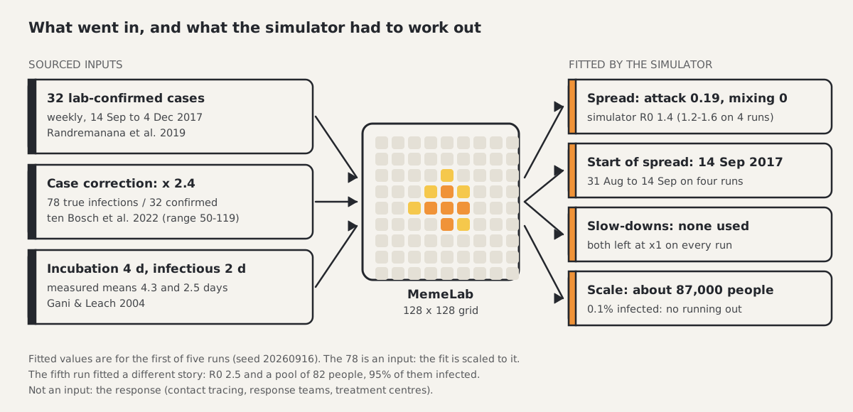
Sourced inputs on the left, fitted values on the right. Nothing on the right is a measurement.
This is a retrospective fit. The simulator saw the whole series up to 4 December before producing its curve, so nothing here is a prediction.
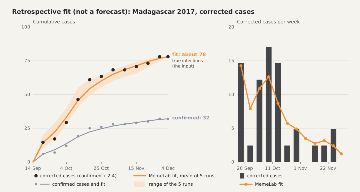
Left: cumulative cases. The corrected series and the fit end at about 78; the confirmed series ends at 32. Right: the same thing as corrected cases per week.
The rebuilt outbreak comes to 32 confirmed cases and about 78 true infections. That match is not a result. The fit is scaled to the corrected series, so it ends at 78 because 78 went in.
The model's own finding is the spread rate. On four of the five runs the fitted reproduction number is between 1.2 and 1.6 (1.2, 1.3, 1.4 and 1.6), in line with the published estimates of about 1.2 to 1.7. On those runs the model does not run out of people: at most 0.2% of the fitted population is infected, and neither slow-down is used. The outbreak in the model ends on its own, because at these settings most chains of infection fizzle out. The fitted start of spread falls between 31 August and 14 September.
The cautions, plainly:
- The 78 is the input, not a finding. With 50 or 119 true infections in place of 78, the fit is the same in every respect except its scale.
- The fit rests on very few simulated individuals: between 6 and 30 per run stand for the whole outbreak.
- One run in five fitted a different story: a reproduction number of 2.5 and a tiny pool of 82 people that runs out, with 95% of them infected. The data cannot tell the two stories apart. Thirty-two cases are too few.
- The classification of cases as confirmed was made after the outbreak. This series did not exist in real time.
- The weekly fit is rough. Summed over the weeks, the fit misses by about 37% of all cases (41 to 52% on single runs). The corrected data peak at 17 cases in the week ending 11 October; the fit has about 13 that week and is flatter throughout.
- It is a fit after the fact, not a forecast.
Run it in your browser
The settings of the first run open in the app from a link: open the case-corrected Madagascar 2017 scenario in MemeLab.
The link sets a 128 by 128 grid, attack rate 0.19, incubation 4 days, infectious period 2 days, no long-range mixing, one first case and the first run's seed, and the run starts by itself. It does not carry the fitted start date, the population scale or the case correction, and it plays a single run where the fit averages several. Fatality in the link is 25%, the share of confirmed cases who died in Madagascar in 2017 with treatment (8 of 32, Randremanana et al. 2019); the fit itself used no deaths. The preset name in the link is only the starting template; every disease setting is overridden.

The linked run at days 14, 28 and 42, showing the middle third of the grid enlarged. Grey is susceptible, amber and orange are incubating and infectious, blue is recovered, dark grey is dead.
The linked run infects 14 simulated individuals, 3 of whom die, and has stopped on its own by day 42. The rest of the 16,384 cells are never touched. That is what the fit looks like from inside: a small cluster that dies out. In the first run's fit, about 15 simulated individuals stand for the 78 true infections.
What is missing: the response
The real outbreak had 7,318 contacts traced and offered preventive antibiotics, response teams from 1 October and treatment centres. None of that is in the recreation. No intervention dates went in, and the two generic slow-downs sit on a fixed 21-day schedule. The model can find that spread was slow. It cannot say that contact tracing or treatment made it so.
That gap showed most clearly in an earlier attempt.
What happened when I fitted the reported counts instead
My first recreation used the 21 cumulative counts of reported pneumonic cases that WHO published between 14 September and 26 November 2017, rising from 28 to 1,854. Fitted after the fact, the simulation ended at 1,876 cases against 1,854 reported, within about 1%.
It matched the total for the wrong reason. The fit chose a reproduction number of 2.7, well above the published estimates, and a pool of about 2,600 people, 72% of them infected by the end. The model explained the levelling-off by running out of people in a small pool. In reality the cities were not depleted, and only dozens of people were infected. Week by week it was rough too: the summed weekly miss was 47% of all reported cases.
I tested that reading directly. When the simulator was not allowed to use up more than a tenth of its pool, its six-week forecasts during the epidemic came out 2.5 to 3.2 times too high. Nothing else in this setup can slow the outbreak early: the first generic slow-down is only allowed from day 49. So the pool of people running out was standing in for the response.
I also tried several sourced changes to see whether any of them fixed it without adding a response: a lower reproduction number from the literature, a one-week reporting delay, and a settlement-style network with two seeded cities. None made the forecasts better, and each time the fit ended the epidemic the same way, by running out of people.
The forecasts made during the epidemic show the same problem. The fit can be stopped at a date and run forward, and the result checked against what was reported later.
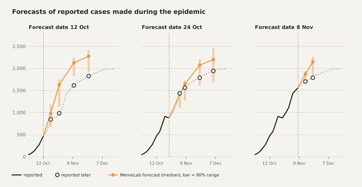
Each panel stops the data at the dashed line. Hollow circles are what WHO reported afterwards.
On 12 October the model expected about 1,160 new reported cases in two weeks; 511 were reported. On 24 October it was close: 768 forecast against 683 reported. On 8 November, as the epidemic wound down, it forecast 584 new cases in two weeks; 226 were reported.
A hypothetical town of 50,000: a model, not a forecast
Everything above is about a real outbreak with real reports. This section is not. It is a what-if for an unnamed, hypothetical town: a speculative model, for education, not a forecast. In a scenario like this the germ hasn't even been confirmed yet, and the data a forecast needs do not exist.
The whole scenario rests on one assumption: that the pathogen is pneumonic plague. If the pathogen is something else, none of this applies.
The headline runs also take a pessimistic spread rate: a reproduction number of 2.7, the high end of published estimates (about 1.2 to 3.5, leaving aside the one fit to raw notifications that gave 5 to 7). It is the value the fit to reported counts produced, and it is well above the 1.2 to 1.6 of the case-corrected fit. Results at lower values are shown alongside.
What I assumed
I wrote the method down before running anything. These are the assumptions:
| Item | Assumption | Where it comes from |
|---|---|---|
| Population | 50,000 people, one simulated cell per person (a 224 by 224 grid, 50,176 cells) | chosen for the scenario |
| Start | one infected person on day 0 | chosen for the scenario |
| Incubation, infectious period | 4 days, 2 days | Gani & Leach 2004 |
| Spread rate, headline | attack rate 0.4 and mixing 0.2 (simulator R0 2.7) | pessimistic: the high end of published estimates |
| Lower spread rates | simulator R0 1.3 and 1.7 | Gani & Leach 2004; Tsuzuki et al. 2017 |
| No response | nothing changes for 42 days | what-if |
| Early response | transmission halved from day 14 | see below |
| Runs | 400 random runs for every combination |
The population is fixed from outside here. In the Madagascar fits the scale was something the simulator worked out; in the scenario I set it to 50,000 and left it alone.
The early response stands for earlier treatment and isolation, plus contact tracing with preventive antibiotics. I represent all of it with one number: a halving of transmission. Two things point to a number of that size. In Madagascar in 2017 the median time from symptom onset to clinical examination was one day, half the two-day infectious period used here (Randremanana et al. 2019). And the fit to reported counts had a late slow-down to 0.56 of the starting rate. Day 14 is an assumption about how long an organised response takes to start. Contact tracing is not simulated person by person.
I do not project deaths. Pneumonic plague is treatable with antibiotics when they are started early, and how many people die depends almost entirely on how early that is. The scenario has no basis for that number.
What the model shows
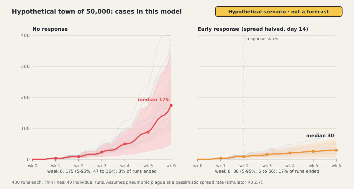
Cases in the model at the pessimistic spread rate (R0 2.7), 400 runs per panel. The shaded band holds 90% of runs; the thin lines are single runs.
At the pessimistic spread rate and with no response, the model starts slowly:
| Week | No response, median (5-95% of runs) | Early response, median (5-95% of runs) |
|---|---|---|
| 1 | 4 (2-5) | 4 (2-5) |
| 2 | 9 (4-13) | 9 (4-13) |
| 3 | 24 (7-44) | 16 (5-28) |
| 4 | 50 (15-92) | 21 (5-41) |
| 5 | 89 (24-174) | 26 (5-53) |
| 6 | 175 (47-364) | 30 (5-66) |
By week 6 the typical run with no response has 175 infections, but the range runs from 47 to 364, and 3% of runs had ended on their own. With the early response the typical run has 30 (5 to 66) and 17% of runs had ended. The same response started at day 28 gives 93 (24 to 182).
In this model the early response slows the outbreak at the pessimistic spread rate without ending it inside six weeks. Half of 2.7 is still above 1.
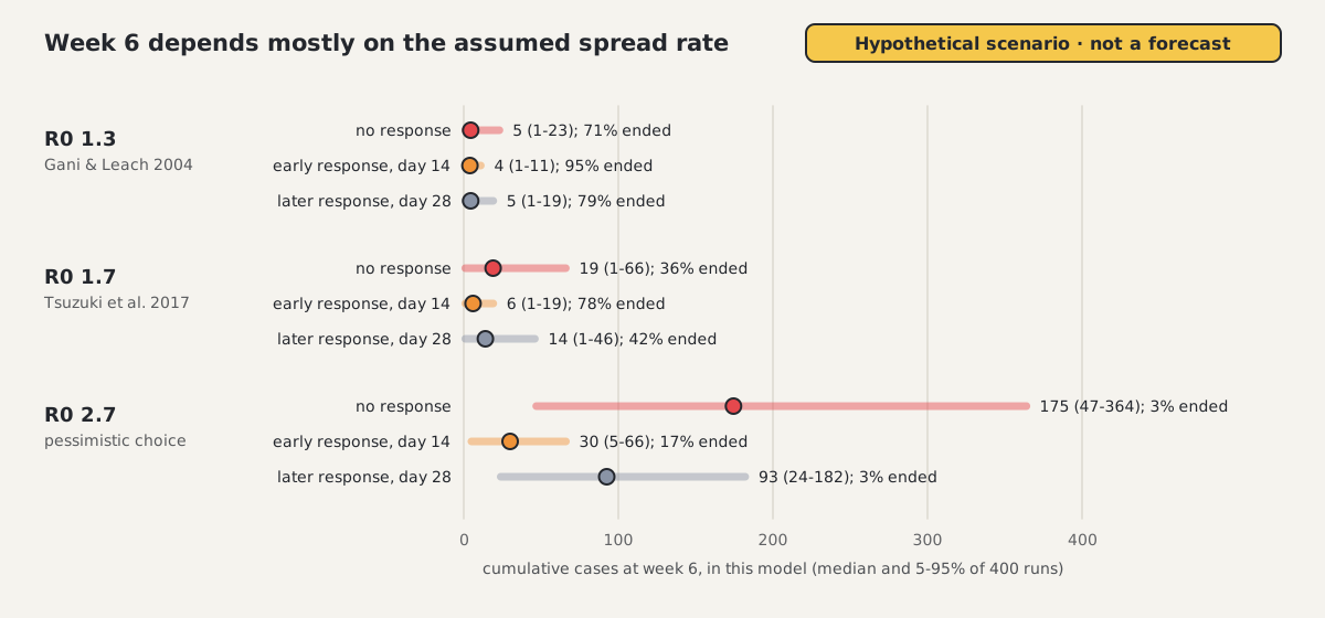
Week 6 under three assumed spread rates. The dot is the median run and the bar holds 90% of runs.
The assumed spread rate matters more than anything else. At a simulator R0 of 1.3, the value Gani and Leach measured from historical outbreaks, the typical run with no response has 5 infections by week 6 and 71% of runs end on their own. At 1.7 it is 19 infections and 36%. With the early response at 1.7, 78% of runs have ended by week 6. A factor of two in one uncertain input moves the answer from a handful of infections to a few hundred. The case-corrected Madagascar fit points to the lower end.
The size of the town barely matters at this horizon. Rerunning the no-response case on towns of 16,384 and 99,856 people gave week-6 medians of 174 and 175. Six weeks after one case, the model has touched well under 1% of the town.
Run the town in your browser
Two links open the scenario in the app, each as a single run with no response: the town at the pessimistic R0 of 2.7 and the same town at R0 1.7.
Each sets the 224 by 224 grid, one first case in the centre, incubation 4 days, infectious period 2 days, mixing 0.2 and the attack rate for that spread rate (0.4 or 0.232). A link shows one run, not the 400 behind the charts. By day 42 the first link's run has 185 infections and the second has 24, both inside the ranges above. The early response is not in the link. Fatality in these links is 95%, because untreated pneumonic plague is close to always fatal (Gani & Leach 2004) and the links show the pessimistic case with no response. The deaths the app then shows are that assumption at work, not a projection. (The mixing slider in the side panel reads 0% after a link opens. The run itself uses 0.2.)
What would change the picture
- A confirmed pathogen. The scenario assumes one. A different pathogen has different timings and a different spread rate, and these numbers would not carry over.
- Real case counts. Even two or three weeks of counts would replace the assumed start and the assumed spread rate with something measured.
- The real response: when treatment and contact tracing start, and how many contacts are reached.
- The town itself. A grid with some long-range mixing is a stand-in for how people meet, not a description of any community.
Not in the model at all: deaths, hospital capacity, age, households, travel in or out, changes in behaviour, and any delay between infection and being counted. As for how far to trust it: the model's forecasts of the Madagascar outbreak made during the epidemic were weak, so read the what-if as an illustration.
Known weakness and later work
MemeLab's forecasts of this outbreak made during the epidemic were weak. It kept expecting growth after the outbreak had turned: by date of symptom onset, reported cases had peaked in the week beginning 2 October, before the first forecast date. Its ranges were also too narrow. During the epidemic, the 90% range held the reported count in 9 of 20 forecasts. A calibrated range would manage about 18.
I suspect the main missing piece is the interventions. Contact tracing with antibiotic prophylaxis (7,318 contacts), response teams from 1 October 2017 and treatment centres are not in the recreation, and the case reports alone do not show the turn in time. A first estimate from the literature puts the combined effect of the response at roughly a halving of transmission from early October 2017, with a range of about 0.3 to 0.75 of the starting rate. I derived it from Hinckley et al. 2012, Nishiura et al. 2006 and Gani & Leach 2004; it is not a published figure for this outbreak. Testing it in the model is under way.
Later work is to pin down the strength of those interventions from the literature, add them to the model, and test again, including on other plague outbreaks. I do not know yet whether that will fix it.
What this does and does not show
- The case-corrected recreation rebuilds 32 confirmed cases and about 78 true infections. The 78 is a published estimate that went in, not a model result.
- What the model found is a spread rate: a reproduction number of 1.2 to 1.6 on four of five runs, in line with published estimates of about 1.2 to 1.7, with no running out of people.
- That finding is fragile. It rests on 6 to 30 simulated individuals per run, the fifth run fitted a reproduction number of 2.5 with a pool of 82 people that runs out, and the weekly fit misses by about 37%.
- The confirmed-case series was classified after the outbreak. Nothing here was available in real time, and nothing here is a forecast.
- The recreation has no contact tracing or other response in it. The app can simulate masks, quarantine and lockdowns, but this recreation leaves them off.
- The fit to all reported cases matched the total (1,876 against 1,854) for the wrong reason, a small pool running out at a reproduction number of 2.7. It does not measure how transmissible the disease was.
- The forecast dates were visible while the fitting recipe was being developed, so none of the forecasts comes from a sealed test.
- The hypothetical town is a speculative model, for education, not a forecast. It shows how the disease might spread under stated assumptions, with a pessimistic spread rate in the headline runs, and it describes no real place.
If you want to see the mechanics for yourself, open one of the links above in the simulator, press play, and try halving the attack rate or switching on quarantine.
Sources
- Randremanana R, et al. Epidemiological characteristics of an urban plague epidemic in Madagascar, August-November, 2017: an outbreak report. Lancet Infect Dis 2019;19:537-545. doi:10.1016/S1473-3099(18)30730-8
- Tsuzuki S, et al. Dynamics of the pneumonic plague epidemic in Madagascar, August to October 2017. Euro Surveill 2017;22(46):17-00710. doi:10.2807/1560-7917.ES.2017.22.46.17-00710
- ten Bosch Q, et al. Analytical framework to evaluate and optimize the use of imperfect diagnostics to inform outbreak response: application to the 2017 plague epidemic in Madagascar. PLoS Biol 2022;20:e3001736. doi:10.1371/journal.pbio.3001736
- WHO Regional Office for Africa. Plague outbreak Madagascar: external situation reports 01 to 14, October to December 2017 (the reported case series, with WHO Disease Outbreak News and weekly bulletins). Report 14
- US cases 1900 to 2009: Hinckley AF, et al. Epidemiol Infect 2012;140:554. doi:10.1017/S0950268811001245
- Transmission trees from older outbreaks: Nishiura H, et al. J Epidemiol Community Health 2006;60:640. doi:10.1136/jech.2005.042424
- Gani R, Leach S. Epidemiologic determinants for modeling pneumonic plague outbreaks. Emerg Infect Dis 2004;10:608-614. doi:10.3201/eid1004.030509
- Majumder MS, et al. Estimation of pneumonic plague transmission in Madagascar, August-November 2017. PLoS Curr 2018. PMC6224036
- Nguyen VK, Parra-Rojas C, Hernandez-Vargas EA. The 2017 plague outbreak in Madagascar: data descriptions and epidemic modelling. Epidemics 2018;25:20-25. doi:10.1016/j.epidem.2018.05.001
- Strong RP (ed.). Report of the International Plague Conference held at Mukden, April 1911. Manila, 1912. archive.org
- Wu Lien-teh. Plague in Manchuria. J Hyg 1922-23;21:62 and 21:262. doi:10.1017/S0022172400031223, doi:10.1017/S0022172400031508
- Bertherat E, et al. Lessons learned about pneumonic plague diagnosis from two outbreaks, Democratic Republic of the Congo. Emerg Infect Dis 2011;17:778-784. doi:10.3201/eid1705.100029
- Begier EM, et al. Pneumonic plague cluster, Uganda, 2004. Emerg Infect Dis 2006;12:460-467. doi:10.3201/eid1203.051051
- WHO. Report of an interregional meeting on prevention and control of plague, 1995 (WHO/CDS/BVI/95.4), and the Technical Advisory Committee papers in Current Science 1996;71(10).
- Qinghai 2009: Wang H, et al. Clin Infect Dis 2011;52:185. doi:10.1093/cid/ciq107. Peru 2010: Donaires LF, et al. Rev Peru Med Exp Salud Publica 2010;27:326.