Armchair epidemiology: the four-hour model that held up
No training, no funding, no permission: how Cellular Defense Automata was written by hand in four hours in 2020, and what six years proved about it.
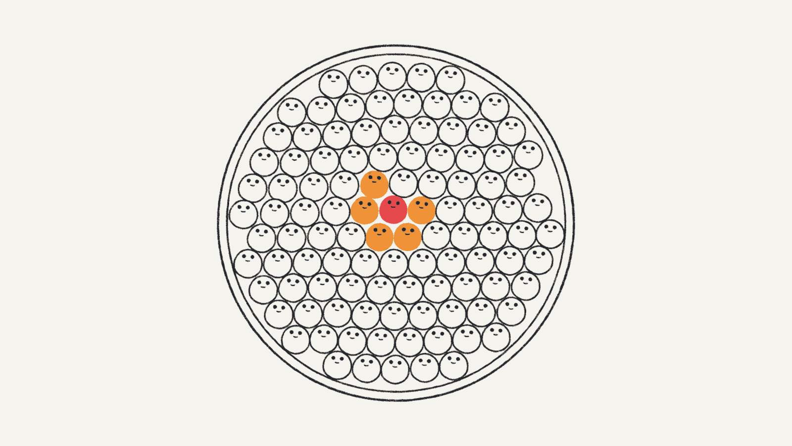
MemeLab is a contagion simulator that runs in your browser. It did not start as a piece of software. It started as an argument I was losing at work, in 2020, about how much risk I was actually taking.
I worked at a site that was an outbreak location for years. Not a hospital, but a place where I routinely had to administer first aid, which is not a job you can do at a distance. Exposures were frequent. The organization shared enough test results that I could see something the official line did not admit: people were getting infected more than once. Meanwhile masking rates around me were falling, and the mask I was permitted to wear was a medical one.
None of that reached me as data first. It reached me as people. This was before vaccines, and I worked directly with a lot of them: people who were positive, people who were about to be, people who were scared and asking me what I thought because I was the one with the first aid kit. I watched outbreaks move through that place in real time: who sat near whom, which room, which shift, and then the results coming back a week later in an order that was never random. You do not forget watching a thing propagate. Long before I wrote a line of code, I had a picture in my head of contagion as something that moved through a structure, through the specific geometry of who is near whom, and not as a number that applied evenly to everyone. That picture is, more or less, the model.
The thing nobody would define
What I kept hearing was the word risk, used as though it meant something precise, and then never defined. Was I at risk? "There's always some risk." Was the mask enough? "It's what the guidance says." Every answer bottomed out in vibes and personal confidence rather than a number attached to a mechanism, and none of them accounted for the specific thing I was worried about: not one exposure, but hundreds of exposures over years.
That distinction turns out to be the whole ballgame, and it is measurable. On fitted filtration efficiency, an N95 is about 98.4%, a surgical mask with ties about 71.5%, and an ear-loop procedure mask about 38.5%. Run that through exposure time and the gap stops looking like a percentage and starts looking like a different outcome: modelling in PNAS put upper-bound infection risk for someone in a surgical mask at roughly 90% after 30 minutes of close exposure, while a fitted FFP2 held around 20% after a full hour. Real-world case-control data pointed the same direction: N95/KN95 wearers had an adjusted odds ratio of 0.17 versus never masking, surgical 0.34.

The question was never "does a medical mask do something." It was "what does it do, times a thousand shifts."
The part that pushed this from a worry to a problem was policy. For a period, employees at my site were barred from supplying their own respiratory protection: no N95s, no elastomerics, bring nothing from home. That was not unique. In April 2020 clinicians were disciplined or fired in the US for wearing their own PPE, and in Ontario a nurses' union had to go to arbitration to establish that homes could not deny a fitted N95 where a point-of-care risk assessment called for one. I was being told my risk was low and being prevented from lowering it.
Four hours, by hand, in 2020
After about a year of having my assumptions challenged by the reinfections and the consistent circulation of the virus I could see in the data, by the mask I was wearing, by the growing evidence on Long COVID, I exercised the right to refuse unsafe work, went home, and wrote a simulator.
It took about four hours. I have no formal training in epidemiology. I had never read another epidemic simulation's source code. I built it from first principles as a cellular automaton because that was the obvious shape of the problem to me: a grid of people, each in a state, each rolling dice against their neighbours every tick. I called it Cellular Defense Automata. This was the pre-ChatGPT era (that launched in November 2022), so every line was typed by a person who was, at that moment, quite angry.
Only later did I learn that lattice models of epidemics are a real and old branch of the field (Sirakoulis 2000, White 2007), and that their individual-based cousins are what governments actually ran (Eubank 2004, Ferguson 2006). I did not reinvent the wheel on purpose. I reinvented it because I needed one and nobody would sell me a real number.
What I put into it was the policy I was living under: the reinfection rate I could actually observe, the masking rates I could actually count, and the protection factor of the masks I was actually allowed. What came out was not the epidemic I had been promised. It was a years-long one, with a long trailing tail: something that would smoulder rather than burn out quickly. And for anyone exposed over and over, a cumulative risk of injury orders of magnitude above the "low" I was being told.
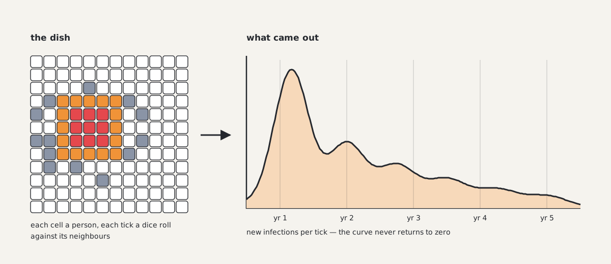
The 2020 output that changed my mind: not a spike and a return to normal, but a tail measured in years.
This did not go over well. It shook the boat professionally. I never returned to that job, and the policy did not change at the time. The months that followed showed I had not been wrong so much as early: the outbreak went on to spread through many epidemiologically linked to the place, staff included.
Claiming either that COVID was airborne or that reinfection was common was, in that period, treated as heretical in some places where the more accurate information had not propagated, and often as socially unacceptable.
Did it hold up?
Six years is long enough to grade my own homework.
The long tail was right. Reinfection went from rare to routine: the UK's infection survey found 92.3% of all identified reinfections occurred during Omicron dominance, which was the mechanism my 2020 model needed to produce a multi-year epidemic instead of a single wave.
The post-viral burden question resolved the same way: Canada's own surveys put longer-term symptoms after infection at 19% of infected adults by June 2023, with roughly 100,000 Canadians never returning to work.
Most infections had not happened yet in 2020. Canadian infection-acquired seroprevalence went from 2.6% to 54.1% between early 2021 and mid-2022. The overwhelming majority of infections came after Omicron, not during the period I was so worried about. Vaccines were available by then, which blunted the damage those infections did. And the thing has receded. I pulled the national wastewater data myself rather than trust a headline: averaged across Ontario sites, the summer 2026 signal is about 88% below summer 2024 (roughly 80% if you weight sites by population served), and about 99% below the January 2022 peak.
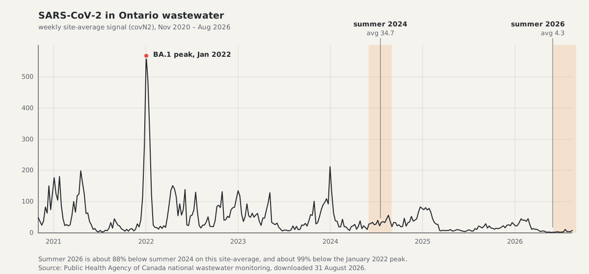
Six years of Ontario wastewater. Note that the shape is the thing my 2020 model got right: not one wave, but a long series of them.
So the model got the shape right and the timing partly wrong, which is the normal outcome for a four-hour model and still better than the guidance I was given. The value was never that it predicted a number. It was that it forced the argument onto terrain where being wrong was visible.
From CDA to MemeLab
I ported the Python original to JavaScript so it could be played rather than run, and named that version MemeLab: same automaton, plus multiple pathogens and a simple evolutionary algorithm, because a model where the germ cannot change is a model that answers the wrong question after month six.
The work then spread sideways into indoor air. The Wells-Riley model (the standard first-pass estimate for airborne infection risk in a room, descended from Riley's 1978 measles study in a school where 97% were vaccinated) is exactly the tool that answers "is this room safe," and almost nobody outside the field can use it. So I built apps that do: clean air delivery rate, air changes per hour, relative risk reduction, in units a person can act on. That branch is live at airsupportproject.com, and it is the same instinct as CDA: take a model that exists and make it usable by the person whose risk it describes.
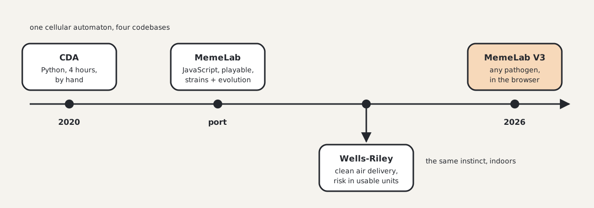
Why it's called MemeLab
The name is not about internet pictures. Richard Dawkins coined meme in The Selfish Gene in 1976 for a unit of culture that replicates: "Just as genes propagate themselves in the gene pool by leaping from body to body via sperms or eggs, so memes propagate themselves in the meme pool by leaping from brain to brain via a process which, in the broad sense, can be called imitation." That is a transmission model. It has a host, a contact and a copy. I have written under the handle TheMemeticist for years, and when I ported the automaton to JavaScript I named it for the general case rather than the specific one, because the automaton does not know what it is carrying.
You can see that in the type the whole engine is parameterised by. A pathogen in MemeLab is this gene vector and nothing else:
export interface StrainGenes {
  attackRate: number; // 0..1 per-contact
  incubation: number; // days
  infectious: number; // days
  ifr: number; // 0..1 base infection-fatality rate
  range: number; // Manhattan radius
  /** Mean duration of post-infection immunity, in days. Use a very large value
   *  (e.g. 36500) for "lifelong" immunity. Daily wane probability = 1/immunityDays. */
  immunityDays: number;
  mutationRate: number; // 0..1 per-replication per-gene
}
Nothing in there says virus. Read it as an idea and most of it still means
something: attackRate is the chance one telling lands, incubation is the
lag between hearing a thing and repeating it, infectious is how long you keep
repeating it, immunityDays is how long until you can be caught by it again,
and mutationRate is the fact that nobody retells a story exactly. ifr is
the seam. A fatality rate has no honest reading for a rumour, and I would
rather point at that than pretend the mapping is clean.
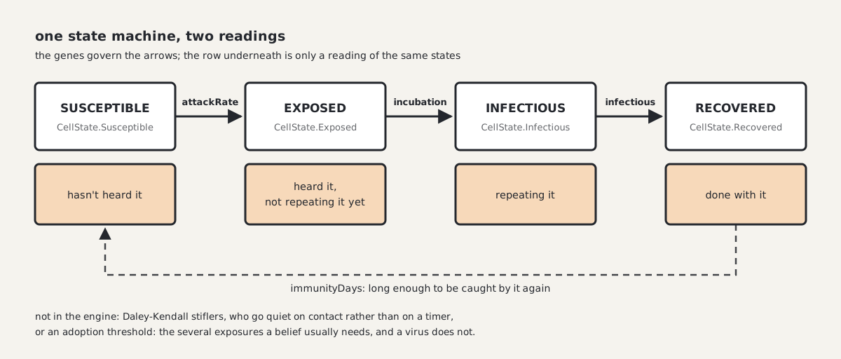
The engine only implements the top row. The bottom row is a reading of it.
The lineage here is real rather than a pun. In 1964 two papers in Nature made this substitution directly: Goffman and Newill generalized epidemic theory to the transmission of ideas, and Daley and Kendall wrote down the first rumour model as a variant of SIR. The rumour-spreading literature still cites those two as its origin points.
Where the analogy breaks is worth being precise about, because the breaks are the interesting part. Daley and Kendall's spreaders become stiflers on meeting somebody who already knows the rumour: they go quiet because of a contact, not because of a clock. MemeLab recovers people on a timer, so it is SIR and not that. A virus also needs only one exposure, whereas a belief usually needs several, from different people. Centola and Macy named that complex contagion, and MemeLab's per-contact dice roll is a simple contagion by construction, with no adoption threshold anywhere in it. And most information never behaves like an epidemic at all: across a billion diffusion events on Twitter, Goel and colleagues found that about 99% of adoptions came from whoever posted a thing or their immediate followers, and only 0.025% of diffusion trees ever reached a hundred people. Almost everything dies in one generation.
What does survive the translation is the part this post is about. Centola later built both networks and ran a real behaviour through them: 1,528 people, a clustered lattice against a random network of matched degree. The behaviour spread farther and faster on the lattice, because reinforcement needs neighbours who share neighbours, and complex contagion depends on the width of the bridges rather than their length. Note the sign, though. For a virus, clustering slows spread, which is the next section. For a behaviour that needs reinforcement, clustering speeds it. Opposite directions, same lesson: the neighbourhood does work that an average erases, and a well-mixed population will give you a confident wrong answer in either direction.
What a lattice knows that an average doesn't
Almost nobody models epidemics this way, and that is worth stating plainly rather than defensively. In a systematic review that screened 4,311 COVID-19 modelling papers from 2020 and fully analysed 242, compartmental models (SIR, SEIR, the well-mixed classics) were 46.1% of the field, and statistical curve-fitting another 31.8%. Network models were 2.34%. Agent-based models were 1.34%. Cellular automata were not a category at all; they live as a minority inside that last 1.34%. Even a review restricted to spatial models folds them in rather than counting them: cellular automata sit at "the low-complexity end" of agent-based modelling there, dismissed in passing because the grids "are usually hypothetical constructs, rather than corresponding to real-life geographies." So the honest form of the claim is a bound, not a figure: the whole spatially explicit branch is low single digits of the epidemic modelling literature, and CA is a minority of that.
I did not pick the unpopular option to be contrary. I picked the one that matched what I had watched happen in a building. And the "hypothetical grids" objection is a fair hit on a plain lattice, which is why MemeLab does not stop at one: it also runs Voronoi settlement networks with Zipf-sized cities and urban/rural density, so the neighbourhood structure can be made to look like somewhere people actually live.
Here is the difference it makes, and you can run both sides yourself. Take one disease. Same incubation, same infectious period, same 34% IFR, and the part that matters most, the same R₀ of 1.9. Seed 0.2% of a 102,400-person population and project six weeks. Well-mixed mean-field: about 77,000 cases and 4,200 deaths. A hexagonal lattice with everything else identical: about 2,100 cases and 400 deaths. Same disease, same reproduction number, same six weeks: roughly a 38× gap in cases, produced by nothing but who is allowed to stand next to whom.
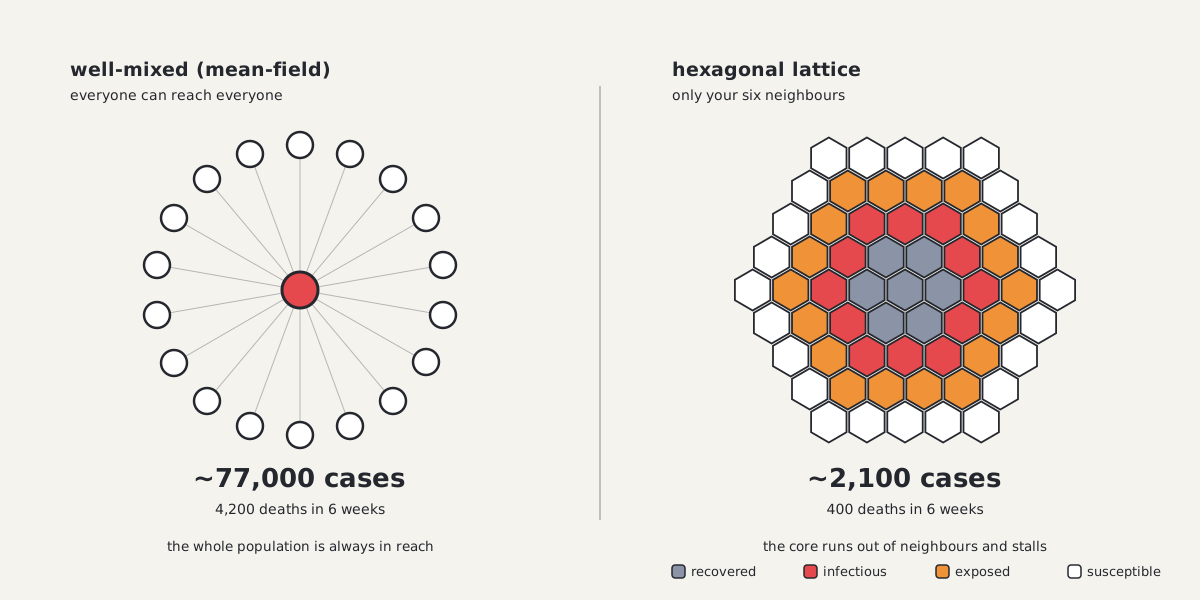
Same disease, same R₀, same six weeks. The only difference is the neighbourhood.
The mechanism stops being mysterious once you see it. A well-mixed model lets every infectious person draw from the entire susceptible pool, forever. On a lattice they can only reach their neighbours, so a cluster burns through the people around it and then stalls against a wall of its own recovered: local herd immunity, arriving early and in one place, with no intervention involved. Sparse regions fade out on their own; dense ones amplify. The epidemic stops being one curve and becomes many small ones that ignite and die at different times, which is what real outbreak data looks like and what a single well-mixed curve structurally cannot produce.
This is what made a four-hour program worth keeping: none of that behaviour is in the program. There is no rule that says "cluster", no rule that says "fade out", no rule that says "second wave". There are cells, states, and a dice roll against the neighbours. Everything else is emergent: the long tail I found in 2020, the hot-spot-then-saturation pattern, the way the whole system changes character when defenses cross a threshold. It falls out of local rules interacting, and nobody has to put it there. That is the real argument for cellular automata, and it is why the machinery that ran a respiratory virus runs a filovirus without changing the code.
It also implies something uncomfortable about fitting. If you fit a well-mixed model to an outbreak that is actually spatially clustered, you can match the curve so far and still be wrong about what comes next, because you have credited to a low R₀ what was really being done by geometry. Fits on spatial lattices tend to recover a considerably higher intrinsic R₀ than the published consensus while landing closer on cumulative totals. That is a claim I owe you numbers for, and it gets its own post.
Why now
I have had ideas for expanding CDA for years and never found the moment. Two things converged. The first is the 2026 Bundibugyo ebolavirus epidemic in the DRC, the largest BDBV outbreak on record and, as of the WHO's mid-August situation report, thousands of confirmed cases with a case-fatality rate near 47%, declared a public health emergency of international concern in May. There is no licensed vaccine for this strain: Ervebo covers Zaire ebolavirus, and the three BDBV candidates CEPI fast-tracked only entered first-in-human trials this summer.
The second is that generative AI made more advanced builds tractable for one person. The useful discovery is that the same cellular automaton generalizes across pathogens: the machinery I wrote for a respiratory virus in 2020 runs a filovirus with different genes, not different code.
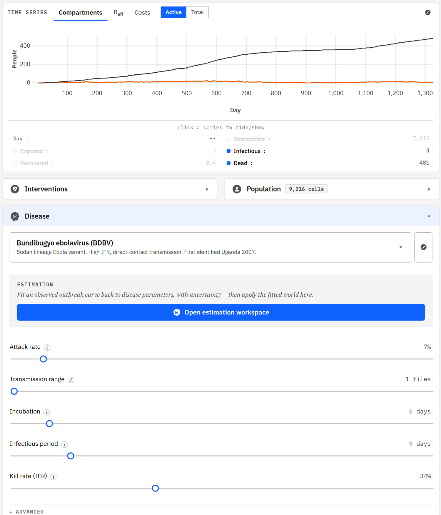
The current build on its default preset. Everything below the curve is a gene value (6-day incubation, 9-day infectious period, 34% IFR), not a different simulator.
This latest iteration is, I believe, the most physically accurate version yet. That is hard to prove, and I want to state the claim honestly: I have not found a publicly available epidemic model that beats it on 6-week-and-beyond cumulative cases and deaths, and I have looked. I think it is the best accessible epidemic simulator or forecast available. "Accessible" is doing real work in that sentence, since the models that might beat it are not ones you can open in a tab.
The longer-horizon projections are still in progress and will get their own post. What I will say now is that the current trajectory is bad, and my own modeling, not anyone's official forecast, is that deaths could reach the tens of thousands depending on vaccine efficacy and rollout. For calibration against people whose job this is: the CDC's modeled scenarios put a 65% probability of more than 20,000 cases within three months under poor isolation, and a Lancet Infectious Diseases stochastic model put the worst case above 66,000 confirmed cases by September if control lapses. At the observed case-fatality rate, that arithmetic is where my number comes from. Both groups are careful to call these planning tools rather than forecasts, and so am I.
Development is now supported by a grant from Balvi, a philanthropic fund for pandemic-related work that conventional funders overlook, which I am grateful for and which is why the pace has changed.
What this blog is for
epi.meme is the live build; the simulator is open source at github.com/TheMemeticist/MemeLabV3. This is where the model write-ups, validation work and engineering notes go, including the long-horizon projections and the accuracy claim above, which I intend to defend with numbers rather than leave as an assertion. There is an RSS feed if you want them delivered.
The whole project comes from one conviction, formed in a bad year: if the answer to "how much risk am I taking" is a feeling, it is not an answer. Open the dish, set the parameters, and watch what the assumptions actually imply.
Welcome to the lab.